What did you find when you ran the WAVE accessibility report on your blog post(s)? As seen in the picture below, I saw a breakdown of the interface of my blog that showed the structure of my blog and potential errors for accessibility of users.
What did you expect and what was surprising? I thought my blog was pretty well setup so I didn’t expect it to flag much. I had only one bad error which was an empty link, which is a good catch by WAVE. However, I think it flagged some of content because of the color contrasts weren’t too visble which I don’t see as a huge issue.
There anything you will do differently going forward? I may change the colour of texts and backgrounds to more contrasting colours to enhance visibility for users visiting the site.

Have you used Text to Speech tools before? Did you find it useful? This was the first time trying text to speech tools and it was an interesting experience. I feel that Text to Speech tools have their own uses, the first that came to mind was augmented reality and virtual reality applications of it. It can generate spoken content without the need of a human-voice actor. I can also see it being applied to generate voice-overs for multimedia content such as animations. The last use case would be for learning aid for those who have visual impairments. They provide an alternative means of accessing written content, making digital information more inclusive and accessible.
Did you try out some of the different voices? What impact did the different voices have on your ability to absorb information?
I tried out a few different voices and found that the voices most-closely resembling humans voices had a positive impact on my ability to absorb information. The voice-principle from Mayer’s Cognitive Theory of Multimedia Learning states that research shows more learning and knowledge retention takes places when using human voice-overs versus artificial voice-overs when presenting learners with multi-media content.
What does inclusive design mean to you?
Inclusive design to me means the practice of creating learning activities and educational environments that are accessible and accommodating to the diverse needs, abilities, backgrounds, and learning styles of all students. The aim of inclusive design is to guarantee that every student is not left out or placed at a disadvantage because of their unique attributes or situations. That can be achieved through equitable access to learning material. They should be made available and usable by all students, regardless of physical or cognitive abilities, disabilities, or cultural backgrounds. This may include involving multiple modalities to accommodate different styles of learning. Learning curriculum should also represent diversity by including various perspectives, backgrounds, and experiences. Furthermore, inclusive design also means offering flexibility in the format at which students can engage with learning content and be assessed for their learning outcomes. This extends to assessment methods as well, assuring the fairness and impartiality of assessment criteria, as well as their ability to accurately gauge their intended metrics, all while avoiding the creation of needless obstacles.
Which design principles did you use to create your infographic in Canva?
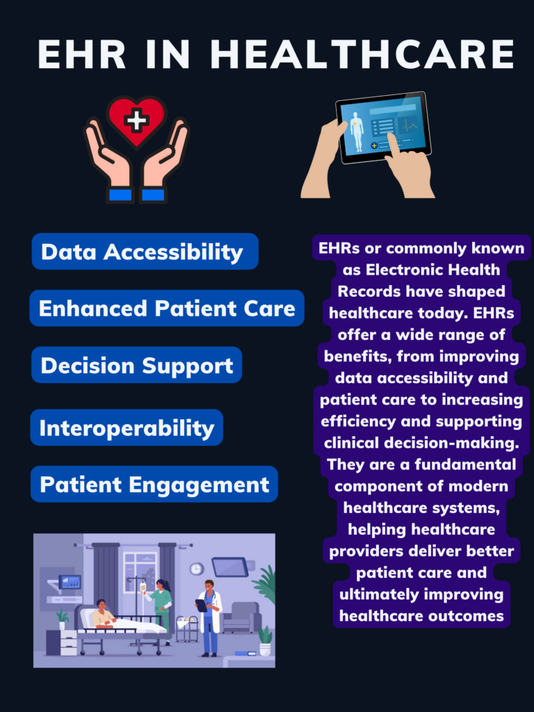
I tried to incorporate all of the design principles in my Canva Infographic. I leveraged color and contrast to my advantage.I picked a palette of shades of blues more leaning towards the darker side. I feel that the color blue commonly represents healthcare related disciplines which is what my infographic topic was on. And felt the shades of blue would contrast well with white text making the information very visible. I added a background color to text boxes to accentuate headings and text. I also incorporated repetition in my infographic, I used one singular type of font and colors right next to each other on the color wheel to have a uniform graphic. Additionally, headings and images were in alignment with each other so the infographic would look smooth and put together. I did consider proximity in my design too, I clustered together elements that were alike together but also used hierarchy to organize the most important information first.
Which elements of a ‘good infographic’ were you able to incorporate? What other principles did you consider?
I incorporated the following elements from the video: Tells a story, one key message, accurate information, and short and sweet. The main message of the infographic was how much EHRs ( Electronic Health Records) improve today healthcare systems in Canada. I tried to portray it as story, and used mainly bullet points to guide the readers towards understanding the main reasons why it can improve our healthcare systems.
What does the template make easier and what does it make harder when creating your infographic?
I ended up not using a template as I did not have access to the premium version of Canva. However, I can presume it would make it easier to adhere to some of the design principles such as balance and contrast in colors, alignment, and hierarchy. It does take away a bit of creative freedom, and if there are elements to the template the user does not like, its quite difficult to remove them without hurting the overall design as Canva purposely chooses each element to compliment each other.
Leave a Reply
You must be logged in to post a comment.